Lizing-P · Credit cooperative · Web development · SEO · Paid search
SEO for a credit cooperative
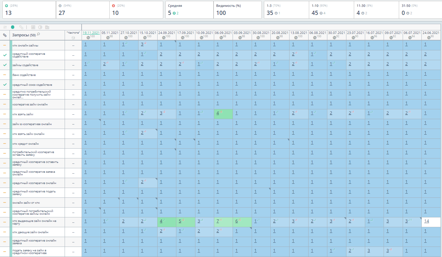
Website redevelopment, SEO and paid search for Lizing-P, a Russian credit cooperative. View the work and ranking report: 45 of 50 keywords in the top 10.
- Services
- Web development · SEO · Paid search
- Region
- North Caucasus & Southern Russia
- Project period
- 18 months
- Website
- Lizing-P

The brief
Replace the cooperative’s error-prone Bitrix website and develop search and advertising across the North Caucasus and Southern federal districts.
Results at a glance
- Keywords in the top 10
- 45 / 50
- Keywords in the top 3
- 35 / 50
Keywords in the ranking report
Keywords in the ranking report
- Project period
- 18 months
- Region
- North Caucasus & Southern Russia
- Ranking snapshot
Lizing-P · Credit cooperative
The challenge
The credit cooperative's website needed to make a complex offer understandable to the relevant regional audience. Visitors had to distinguish the organisation, the services available and the conditions that required an individual discussion. SEO alone would have been incomplete if a person arrived on a vague page and could not understand the next step. We therefore connected the service structure, organisation information and enquiry route, while aligning paid campaigns with pages that explained the offer in a consistent and measured way.
Where we started
We began by separating service-related searches from regional questions and general information needs. These groups were compared with the website's existing sections to identify where the offer was unclear or several pages overlapped. We then reviewed the information a visitor encountered before submitting an enquiry. The starting plan prioritised clear service descriptions, consistent organisation details and a direct route to contact, giving SEO and paid search a common set of destinations.
Problems we solved
The existing website limited further development
Before
The cooperative’s Bitrix website contained technical errors. SEO required a more dependable website as well as clearer service pages.
What we changed
We developed a replacement website and combined its launch with SEO and paid search, treating the destination pages and acquisition channels as one project.
Different financial enquiries needed separate pages
Before
Loan enquiries, savings programmes and online contact searches expressed different needs. A shared description blurred the next step for each visitor.
What we changed
We separated these query groups, matched them to relevant service content and explained the route to a discussion with the cooperative.
What we did
Clarified services and regional relevance
We organised the service pages so each one described a distinct visitor need and the relevant next step. Regional information was connected with actual contact and service details rather than repeated as a decorative keyword. Internal links helped users move between an explanation of the offer and the information about the cooperative. This gave search queries a more precise destination and made the site's structure easier to follow.
The new website replaced the original Bitrix implementation with errors; this was a redevelopment project as well as SEO.
Made financial terms easier to understand
We worked on the order in which service information appeared. The page first explained the nature of the offer, then the important conditions and the questions to clarify during a consultation. Relevant qualifications stayed close to the statements they affected. This reduced the risk of a short promotional phrase being read without context and helped visitors prepare a more informed enquiry about their own circumstances.
The tracked demand included loan, online-cooperative and savings-programme queries. The original report records examples moving from position 24 to 3 and from 22 to 6.
Connected advertising with complete landing pages
We aligned advertising messages with the actual service explanations on the website. Different requests were directed to relevant pages instead of relying on one broad destination. The landing-page review included contact visibility and the meaning of the action offered to the visitor. This kept the campaign promise and the website content consistent, allowing later adjustments to address a specific service or regional need rather than an undifferentiated flow of clicks.
Made business details and contact options clearer
We brought organisation and contact information into a clearer relationship with the service content. Visitors could move from the offer to the details needed to understand who would respond to their enquiry. Mobile layouts, headings and internal links were checked on the important templates. The result was a more consistent route through the website, with the practical contact step presented as the beginning of a discussion rather than a completed financial decision.
Key decisions
The main difficulty was balancing a clear commercial message with the need to preserve conditions and individual assessment. Simplifying the page too far could make the offer appear broader or more certain than intended, while dense information could prevent a visitor from understanding it at all. We solved this through a layered presentation: a plain explanation, nearby conditions and a clear route to consultation. SEO and advertising then used that same logic, keeping the wording consistent across the first contact points.
What changed
The project connected regional search visibility with a clearer explanation of the cooperative and its services. Important pages became more consistent in structure, conditions and contact actions. The work demonstrated how promotion in a sensitive commercial category benefited from precise information and a well-defined enquiry stage, with the website preparing a discussion rather than replacing it.
Results in detail
Search rankings
Snapshot: 2021-11-19. The report tracks 50 queries. 45 are in the top ten; 35 are in the top three.
 Explore the original report
 Search performance
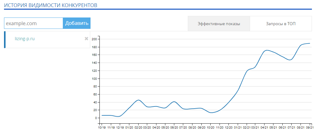
Effective impressions · Lizing-P
10.2019 — 09.2021
 Explore the chart